Responsive Advertisements - A Few Tips
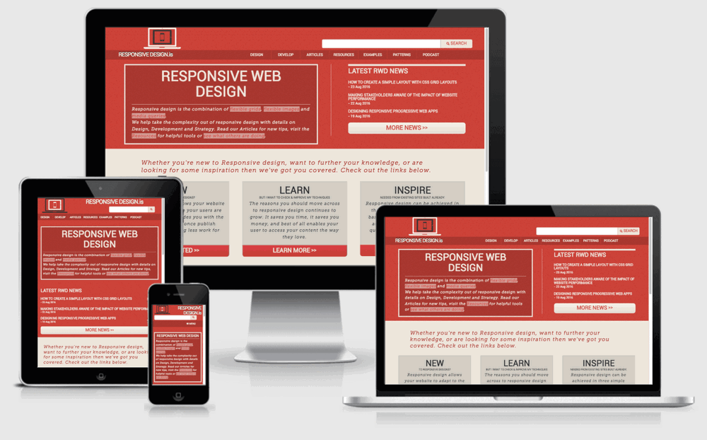
Responsive Design (and responsiveness) is one of those new web design ideas that changed everything. Suddenly, with the proliferation of mobile devices, we had to start making our websites for a new audience, and create the impossible product: something that appeals to everyone and works on everything. Responsive Design is still new enough to be a buzzword, but it’s actually a really simple concept that just makes sense: your website should look good on any screen, anywhere, no matter what. Content should be like water, and flow into whatever form is needed.
Most websites are built with responsive design in mind, now, and it’s no longer the huge development sinkhole it was before. Systems like WordPress and 960 make it accessible to everyone, and take care of it for you. Responsive design has come a long way, and it isn’t that scary anymore. Except when it comes to banner advertisements.

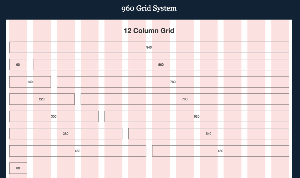
The 960 Grid System works off a resizing column structure. Sometimes banners don’t fit their containers, overflowing off the side, or they’re too so small or compressed and become unreadable. Still other times you might find a banner blocking an important part of a webpage, like the home button. Considering one of the main reasons people block ads are their intrusiveness a banner that stops someone from enjoying your website is pretty much asking people to block your banners. It’s a nightmare. That’s where AdButler can help. We’re responsive friendly and integrate with pretty much any existing design style.
Responsiveness is a whole field of design and there’s no one way to make it work with advertising. However, we have a few tips on what works best. Each website is different, so it’s okay if you find yourself ignoring some of the advice below. And, hey, keep an eye out for our article on responsive philosophy, coming up soon.
1. Talk to your partners
Before you start looking at anything to do with responsive banners you’ll need to consult your advertising partners to find out if they even want their banners to be responsive. Usually, they’ll jump right on the opportunity and do whatever they can to help. But sometimes not. Always let your advertiser know ahead of time. Nothing’s worse than an advertiser thinking they’re paying for one size of banner space but actually getting another one. If you’re selling a skyscraper, make sure that you’re giving them one.

Source: Stéphanie Walter / Wikimedia Commons
2. Make sure you have the right stuff
Once you have the go ahead from your advertising partners, look at how your website already flows. If your sidebar simply shrinks, aim to have different graphics for different screen sizes. You don’t want a beautifully designed banner ad to be distorted by a miss-sized container, or a mobile user loading a super high resolution banner and eating up all their data. However, if your sidebar flows to the bottom of the page, maybe look at showing a bigger version of the same banner, or a more compressed one for mobile users.
3. Targets or Resizing
The next step is to figure out how you want your responsiveness to work. When talking to an advertising partner who wants responsiveness, they’ll generally send you different versions of a banner which they want different users to see. If that’s the case, AdButler’s targeting features make it especially easy to implement.
You see, when placing a banner with an asynchronous tag, the zone will disappear if it can’t display a banner. That means if you have, say, two zones (one mobile, one desktop) stacked on top of each other, only one will ever show. You can learn more about targeting by watching our video.

4. Resizing works too.
However, you can’t always use targets. Whether your advertiser doesn’t actually have multiple sizes for you to use, or your user base is too spread out across multiple sizes, you might find yourself in the unique situation where targets don’t make sense. We’ve planned for that. AdButler’s responsiveness options allow you to set on a per zone basis whether it resizes or not, and how it resizes.
If you go into the zone in question, you’ll find our responsive options, which by default are set to fixed dimension delivery (that’s the size of the zone). You can switch this to be either automatic (AdButler resize the banner based on the container it’s in) or to have no dimensions (allowing you to apply CSS to the ad and change it however you want).
Keep in mind, though, there is a downside to this style of responsiveness. Iframes are inherently responsive unfriendly, so with our dimension resizing options, you won’t be able to use our asynchronous tags.
5. Once your banners are there….
Always test, and look at your website from every angle you can, whether it’s with Chrome’s excellent inspect mode, or by opening your website up on multiple devices. Keep an eye out for oddities and glitches, and make sure to squash them when they come up. There are great tools out there to help you keep on top of responsiveness, and your users will love you when you get it right. However, if you start to slip, and suddenly banners are blocking your nav bar or text is appearing off the screen, no one’s going to be happy. Content is fluid, we just need to make sure it doesn’t slip through the cracks.