How to make custom native responsive banner ads
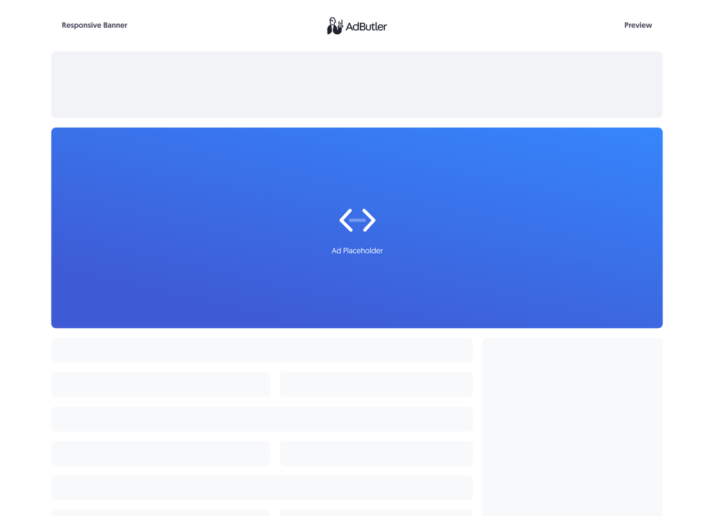
Responsive banner ads are flexible versions of the standard 320x50 banner ad. Instead of having fixed dimensions, a responsive banner ad's container adjusts to fit the creative.
If you'd rather sanitize the template and have only HTML inside it, you should make your responsive banner ad using a styled native ad template instead. For more information on the differences between custom native ads and styled native ads, read About native ad templates
You will learn:
- How to create a template for a custom responsive banner ad. You can customize the sample code to fit your needs.
- How to create a custom responsive banner ad item once you have a custom responsive banner template.
How to create a custom responsive banner ad template
This template will require the user to provide the URL to where the image creative is hosted when creating the responsive banner ad item.
- Click Templates in the left navigation menu. The Templates section will appear.
- Click Native Ad Templates. The Native Ad Templates subsection will appear.
- Click Add Native Ad Template. The New Native Template window will appear.
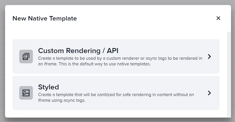
- Click Custom Rendering/API. The New Native Ad Template page will appear.
- Name the template then add an image URL variable. In our sample code, we called this variable ImageURL.
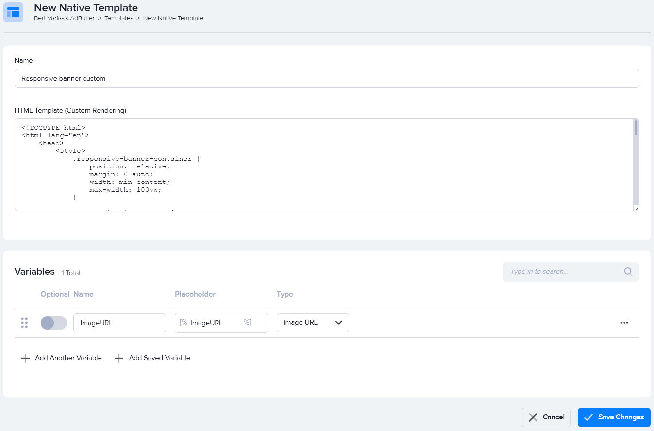
- Enter the code in the HTML Template (Custom Rendering) field, then click Save Changes.
Here's the code we used in our example:
<!DOCTYPE html>
<html lang="en">
    <head>
        <style>
            .responsive-banner-container {
                position: relative;
                margin: 0 auto;
                width: min-content;
                max-width: 100vw;
            }

            .responsive-image-container {
                position: relative;
            }

            .responsive-image {
                max-width: 100vw;
            }

            .responsive-banner-close-button-container {
                position: absolute;
                top: 5px;
                right: 5px;
                cursor: pointer;
            }

            .responsive-banner-close-button {
                width: 21px;
                text-align: center;
                display: inline-block;
                color: #ffffff;
                font-size: 18px;
                background: #000000;
                border-radius: 21px;
                user-select: none;
            }
        </style>
    </head>
    <body>
        <div>
            <div class="responsive-banner-container">
                <a target="_blank" href="[TRACKING_LINK]" class="responsive-image-container">
                    <img class="responsive-image" src="[%ImageURL%]">
                </a>
                <div class="responsive-banner-close-button-container">
                    <span class="responsive-banner-close-button" onclick="closeButton()">×</span>
                </div>
            </div>
        </div>
        <script>
            function closeButton() {
                document.querySelector('.responsive-banner-container').style.display = 'none';
            }
        </script>
    </body>
</html>
You can now use this template to create a custom responsive banner ad item.
How to create a custom responsive banner ad item
- Go to the section of the relevant zone (Your AdButler > Publishers > Your Publisher > Your Zone) or campaign (Your AdButler > Advertisers > Your Advertiser > Your Campaign).
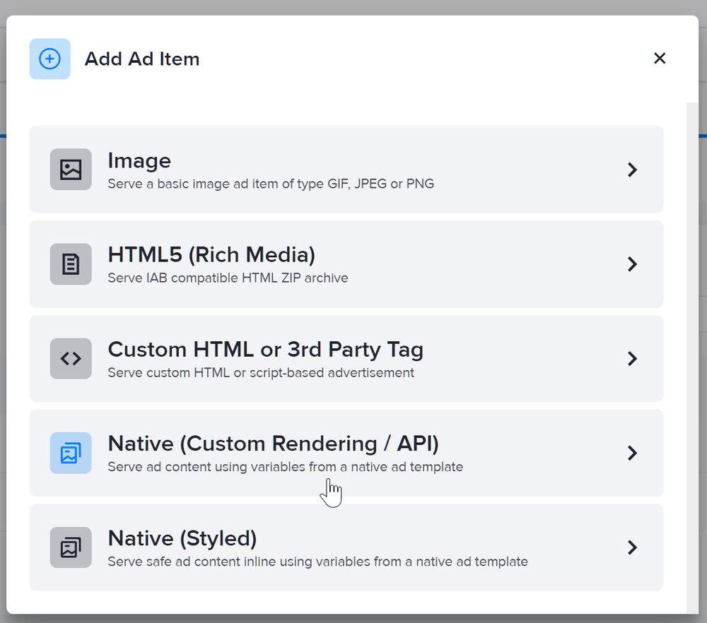
- Click Add Ad Item in the Ad Items table. The Add Ad Item window will appear.
- Click Native (Custom Rendering/API). The New Ad Item page will appear.
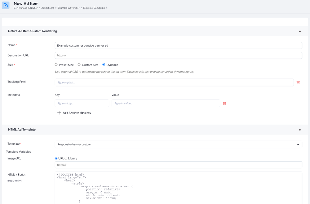
- Set the ad item's size to Dynamic.
- Select your responsive banner custom native template in the Template dropdown menu.
- Fill in the rest of the fields as needed, including the image URL. If you entered a destination URL, you can test it by clicking Open Destination URL to the right of the field.
- Click Save Ad Item.
