How to make custom native slider ads
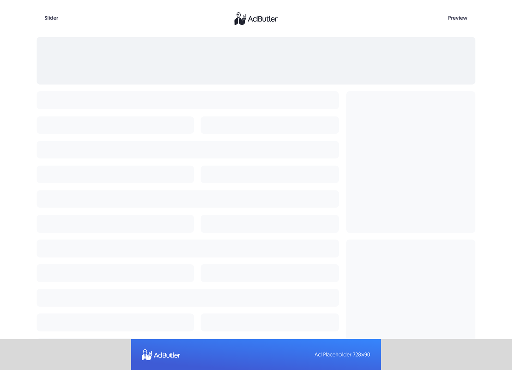
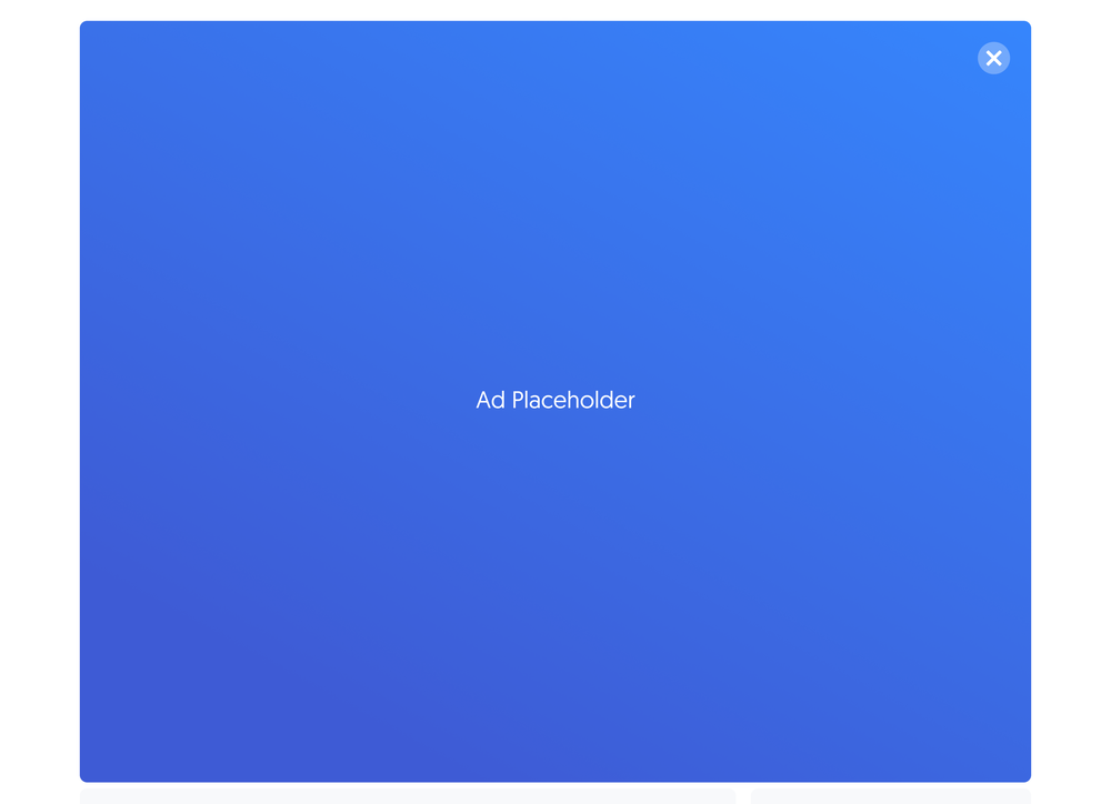
Slider ads are banner ads that appear at the bottom of the page. They prompt the viewer to click and slide their mouse cursor over the banner. Doing so will reveal a second image. You can use native templates to create slider ad items that are tailored to your needs.
If you'd rather sanitize the template and have only HTML inside it, you should make your slider ad using a styled native ad template instead. For more information on the differences between custom native ads and styled native ads, read About native ad templates.
You will learn:
- How to create a template for a custom slider ad. You can customize the sample code to fit your needs.
- How to create a custom slider ad item once you have a custom slider template.
How to create a custom slider ad template
This template will require the user to provide the URLs to where the image creatives are hosted when creating the slider ad item.
- Click Native Ad Templates in the left navigation menu to go to the Templates section.
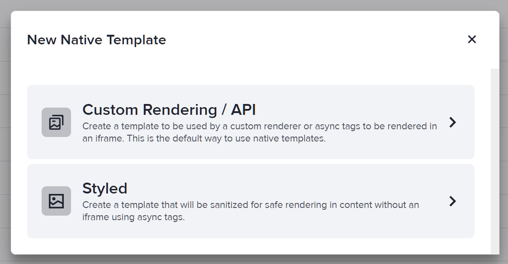
- Click Add Native Ad Template in the Native Ad Templates table. The New Native Template window will appear.
- Click Custom Rendering/API. The New Native Ad Template page will appear.
- Name the template then add two image URL variables. In our sample code, we called these variables ImageURL and ImageURL2, respectively.
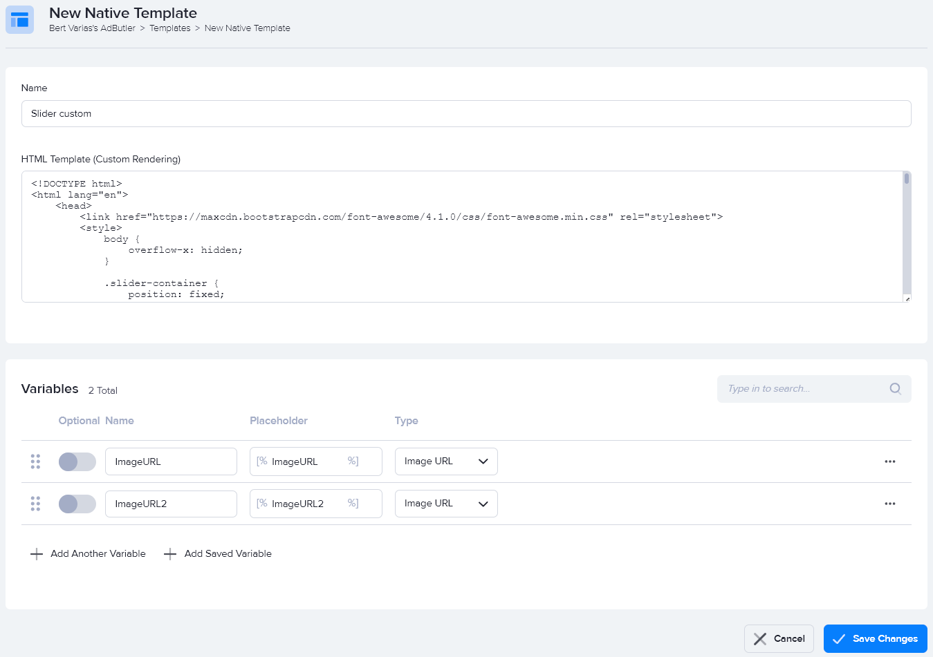
- Enter the code in the HTML Template (Custom Rendering) field, then click Save Changes.
Here's the code we used in our example:
<!DOCTYPE html>
<html lang="en">
    <head>
        <link href="https://maxcdn.bootstrapcdn.com/font-awesome/4.1.0/css/font-awesome.min.css" rel="stylesheet">
        <style>
            body {
                overflow-x: hidden;
            }

            .slider-container {
                position: fixed;
                bottom: 0;
                left: 0;
                width: 100%;
                background-color: rgba(0, 0, 0, 0.25);
                transition: left 2s ease-in-out;
            }

            .slider-image-container {
                position: relative;
                width: 728px;
                height: 90px;
                margin: 0 auto;
            }

            .slider-image {
                position: absolute;
                top: 0;
                left: 0;
                width: 728px;
                height: 90px;
            }

            .slider-button-container {
                position: absolute;
                top: 0;
                right: 10px;
                height: 100%;
                cursor: pointer;
                display: flex;
                align-items: center;
                justify-content: center;
            }

            .slider-button {
                font-size: 28px;
                color: #ffffff;
            }

            .slider-close-button-container {
                position: absolute;
                top: 3px;
                right: 3px;
                cursor: pointer;
            }

            .slider-close-button {
                width: 21px;
                text-align: center;
                display: inline-block;
                color: #ffffff;
                font-size: 18px;
                background: #000000;
                border-radius: 21px;
                user-select: none;
            }

            .slider-full-screen-container {
                position: absolute;
                top: 0;
                left: 100%;
                transition: left 2s ease-in-out;
                width: 100vw;
                height: 100vh;
                background-color: rgba(0,0,0, 0.25);
                display: flex;
                align-items: center;
                justify-content: center;
            }

            .slider-full-screen-image-container {
                position: relative;
            }

            .slider-full-screen-image-container a img {
                max-width: 80vw;
                max-height: 80vh;
            }

            .slider-full-screen-close-button-container {
                position: absolute;
                top: 3px;
                right: 3px;
                cursor: pointer;
            }

            .slider-full-screen-close-button {
                width: 21px;
                text-align: center;
                display: inline-block;
                color: #ffffff;
                font-size: 18px;
                background: #000000;
                border-radius: 21px;
                user-select: none;
            }
        </style>
    </head>
    <body>
        <script>
            function slideLeft() {
                document.querySelector('.slider-container').style.left = '-100%';
                document.querySelector('.slider-full-screen-container').style.left = '0';
            }

            function slideRight() {
                document.querySelector('.slider-container').style.left = '0';
                document.querySelector('.slider-full-screen-container').style.left = '100%';
            }

            function closeButton() {
                document.querySelector('.slider-container').style.display = 'none';
                document.querySelector('.slider-full-screen-container').style.display = 'none';
            }
        </script>
        <div class="slider-container">
            <div class="slider-image-container">
                <a target="_blank" href="[TRACKING_LINK]" class="slider-image">
                    <img src="[%ImageURL%]">
                </a>
                <div class="slider-close-button-container">
                    <span class="slider-close-button" onclick="closeButton()">×</span>
                </div>
            </div>
            <div class="slider-button-container" onclick="slideLeft()">
                <div class="slider-button">
                    Click here to see more <i class="fa fa-angle-double-right" aria-hidden="true"></i>
                </div>
            </div>
        </div>
        <div class="slider-full-screen-container">
            <div class="slider-full-screen-image-container">
                <a target="_blank" href="[TRACKING_LINK]" class="slider-full-screen-image">
                    <img src="[%ImageURL2%]">
                </a>
                <div class="slider-full-screen-close-button-container">
                    <span class="slider-full-screen-close-button" onclick="slideRight()">×</span>
                </div>
            </div>
        </div>
    </body>
</html>
You can now use this template to create a custom slider ad item.
How to create a custom slider ad item
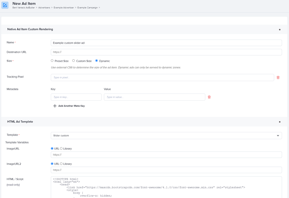
- Go to the section of the relevant zone (Your AdButler > Publishers > Your Publisher > Your Zone) or campaign (Your AdButler > Advertisers > Your Advertiser > Your Campaign).
- Click Add Ad Item in the Ad Items table. The Add Ad Item window will appear.
- Click Native (Custom Rendering/API). The New Ad Item page will appear.
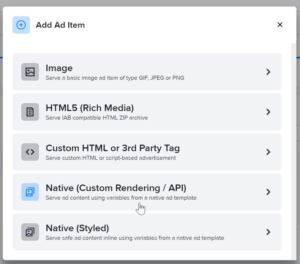
- Set the ad item's size to Dynamic.
- Select your slider custom native ad template in the Template dropdown menu.
- Fill in the rest of the fields as needed, including the image URLs. If you entered a destination URL, you can test it by clicking Open Destination URL to the right of the field.
- Click Save Ad Item.
